This is my report on the design of DMCoach, a mobile app that helps people with diabetes to manage their health and empowers health professionals to deliver better care for their patients. The user research and design activities took place between January and April. The app was developed between May and July: in August and September we carried out the formative evaluation and the design adjustments. We started the summative evaluation in October, then analysed the data and wrote the final deliverable in December. Check also my account of the evaluation of DMCoach.
My role
I was responsible for the user research and design, and I was Activity Leader for the evaluation activities. I planned, executed, and managed a small team on the user research, design, formative and summative evaluation activities. I was part of a multidisciplinary team of developers, researchers and junior designers, alongside Engineering (R&D IT Systems for Health) and Imec. I produced the deliverables for the design and evaluation by December 2018.
The problem
The World Health Organization reported that the number of people with diabetes increased from 108 million in 1980 to 422 million in 2014, and that premature mortality from diabetes increased of 5% from 2000to 2016. Out of all the people with diabetes, more than 95% have type 2 diabetes (DMT2), which is largely the result of excessive body weight and physical inactivity. Substantial evidence suggests that DMT2 can be prevented and improved with physical activity
and proper nutrition.
The challenge
Our challenge was to develop a mobile service to help patients with DMT2 to adopt a healthy lifestyle, and physicians deliver better care. The project was fast-paced and included the whole design process from user research to the final summative evaluation with patients. It was key to help me develop remote project management and communication skills because the team was distributed across Europe, and I was contributing to other two research/design projects at the same time. I used AbstractSpoon to multitask better and keep track of the tight schedule.
The process in short
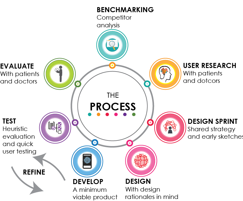
- Benchmarking. We did a competitor analysis on 179 mobile apps to explore the best approaches toward food/physical activity tracking, persuasion strategies, and the involvement of healthcare professionals.
- User research. We researched the scientific literature for novel approaches to diabetes management and behaviour change. Then we focused on Italian patients and physicians: we sent out three surveys to doctors and patients, and held a focus group with doctors to: 1) explore patients’ technology acceptance, and attitudes toward diabetes management and behaviour change; and 2) collect doctors’ needs and desiderata for a more effective and efficient treatment.
- Design. With the results of the user research in mind, we sinthethized user stories, ran a design sprint in two rounds, and designed the app with our design rationales in mind.
- Develop and test. We did several iterations of development and testing, using both expert evaluation and user testing.
- Evaluate. We ran the summative evaluation in three different cities (two in Italy and one in the Netherlands). Finally, we analysed the data and handed out the deliverables.
The discovery
We did a benchmark analysis of 127 mobile apps for diabetes management and 52 food diaries (Android+iOS). We annotated a shared spreadsheet with details about persuasion strategies, the involvement of professional caregivers, and food/physical activity tracking.
We found that the vast majority of the apps for diabetes management featured blood sugar, physical activity and nutrition tracking, but only few provided tailored motivational feedback. We also noticed that only 5 of them mentioned they involved health practitioners in the design phase. Also, although 20 apps allowed patients to share their data by email, no one provided full in-app communication with one’s family doctor.
No app for diabetes management provided patient/doctor communication.
We then focused on health practitioners and patients:
- We sent out a short survey to 24 physicians to understand what kind of information they deemed more important when monitoring diabetic patients, their preferred interaction patterns, their attitude towards national and international guidelines, and how much they tailored lifestyle advice on individual patients.
- We asked these physicians to have their patients fill in a short questionnaire: the goal was to explore technology familiarity in our specific target users. Unfortunately, the number of patients we were able to reach with this questionnaire wasn’t enough to get meaningful insights, fast. We had little time left for user research: we needed to quickly move to the data analysis to inform the design.
- So I designed an online questionnaire that not only investigated technology familiarity, but also self-management practices, patients’ relationship with caregivers, tracking habits and needs. After a quick internal pilot testing, we sent out the questionnaire in English and in Italian. To gather more data faster, we posted the questionnaire on online forums about diabetes, and contacted national organizations for diabetes management, which forwarded the questionnaire to their associates.
- This increased our chances to get enough respondents. I supervised an undergraduate student on this, and we were able to collect substantial data from 132 diabetic patients in just a few weeks. I used LimeSurvey to manage this questionnaire because it was a bit more complicated than the previous ones and contained a few logic jumps.
- This approach speeded up the process and made it more efficient, allowing me to analyse the data in time for the co-design sessions. It also brought an unexpected and fortunate discover: I found out that Italian patients had rather peculiar habits regarding data tracking, compared to English-speaking respondents. This clearly suggested cultural differences that should be taken into account when addressing non-Italian markets.
- We held a focus group with 2 doctors to explore pain points and desiderata in patient management.
We found that Italian patients…
…did not track their data (mostly), but when they did, they used paper or just their memory.
…did not share their data with doctors between visits.
Based on these data, one would seriously doubt that a mobile app for data tracking would be useful. But we looked deeper and found that our patients:
- Would have been happy to track, and share, their data with doctors to be monitored, have directions on how to behave, have feedback on their exams.
- Longed for trustworthy information: they craved sound information, and specifically, actionable information on nutrition, to avoid sugar peaks, and to know if and when they could “give in to temptation”, to enjoy sometimes pizza or wine.
We found that Italian patients longed for trustworthy information about diabetes and would have been happy to share their data with doctors to be monitored.
We also found that Italian physicians…
…Needed to administer personalized treatment, not only regarding medicine intake and frequency of blood sugar measurements, but also regarding nutrition and physical activity.
…Wanted patients to track physical activity, sigarettes, alcohol.
…Wanted patients keep a detailed food diary only for a limited time at the beginning of treatment, to help set correct habits.
…Wanted to monitor patients using concise reports on a few indicators, receive prompt alerts if a patient’s data deviated from an optimal range, and give positive feedback for good habits.
…Had many patients and little time: general practitioners in Italy can have up to 1500 patients, and the doctors we interviewed confirmed that they usually could allocate only 10 minutes per patient.
The design sprint
We designed personas based on our findings, to guide design decisions and foster empathy amongst our users and the team. To comply with time constraints of the team members, we did two iterations:
- A two-day long design sprint with the whole team to converge on the main approach and lay the foundations of the mobile app;
- A one-day follow-up to focus on the open question “How might we show user’s progress toward lifestyle goals?”.
The morning of the first iteration we met up with two UX and HCI researchers, two developers experienced in diabetes management and two junior designers. We introduced the key takeaways from benchmarking, user research, and psychological theories of behavior change. We outlined our personas, their needs and context:
Mario
A 78-years-old overweighted widower with bad eating habits, who has been just recently diagnosed with diabetes.
Roswitha
A younger lady with a positive attitude towards a healthy lifestyle, who has been living with diabetes for several years and has already put in practice some healthy behaviour change.
Giancarlo
A diabetologist who in a typical day can dedicate only 10 minutes to each patient and has no time to individually explain positive lifestyle change.

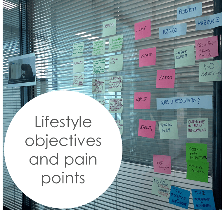
- We attached all this material and resources on the wall to act as our shared distributed external memory for the team, and to help our short-term memories. It kept everything that mattered smultaneously visible and easily accessible.
- With all these resources in plain sight, we elicited users’ paint points: on diabetes management for patients and on patient management for doctors. To guide priorities and design, we attached all these pain points on the wall, next to our personas.
Based on our personas and pain points, we identified two strategies to foster behaviour change
Education & Motivation for Mario
Lower stages of TTM
Short educational pills to increase the cognitive dissonance between attitudes and bad habits and trigger behaviour change, plus rewarding feedback for baby steps towards healthy eating and physical activity.
Motivation & Awareness for Roswitha
Higher stages of TTM
Tailored feedback and motivational messages to keep intrinsic motivation high, and direct access to a dedicated area in the app where she can keep track of her progress towards lifestyle goals.
- In these strategies, all motivational feedback is tailored on the user’s tracked behaviour, stage of change, or sent by the doctor.
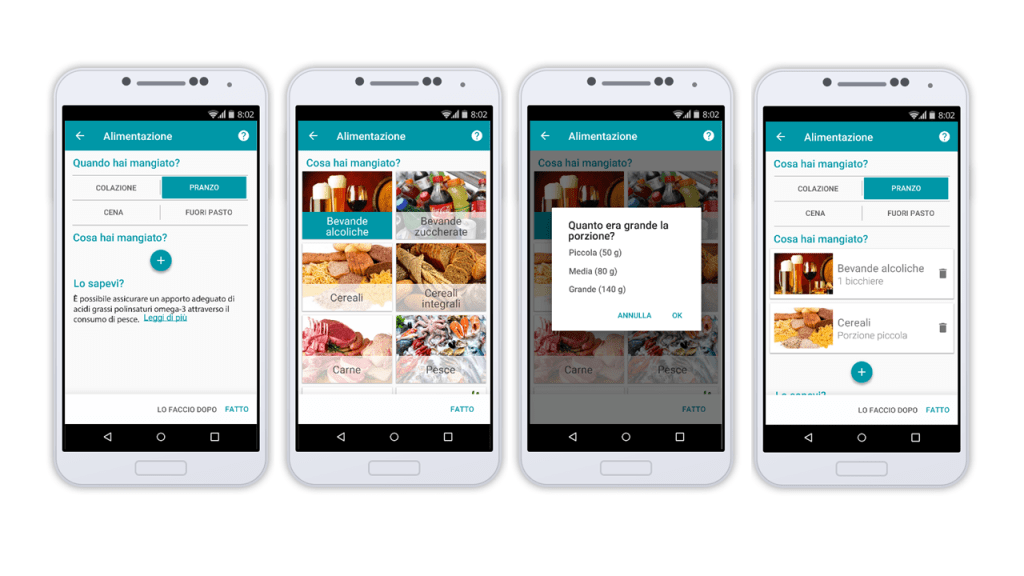
- We designed the user journeys to visually map the main stages of user interaction with the system. Keeping in mind that our user research pointed to low technology familiarity, we envisioned a great deal of interaction to be initiated not by the user, but by the system through notifications, adopting a conversational metaphor in which the system (or the doctor) sends messages to the user providing educational content, tailored feedback and asking for data.
- Following the user journeys, we outlined a few low fidelity sketches to converge on a shared approach.
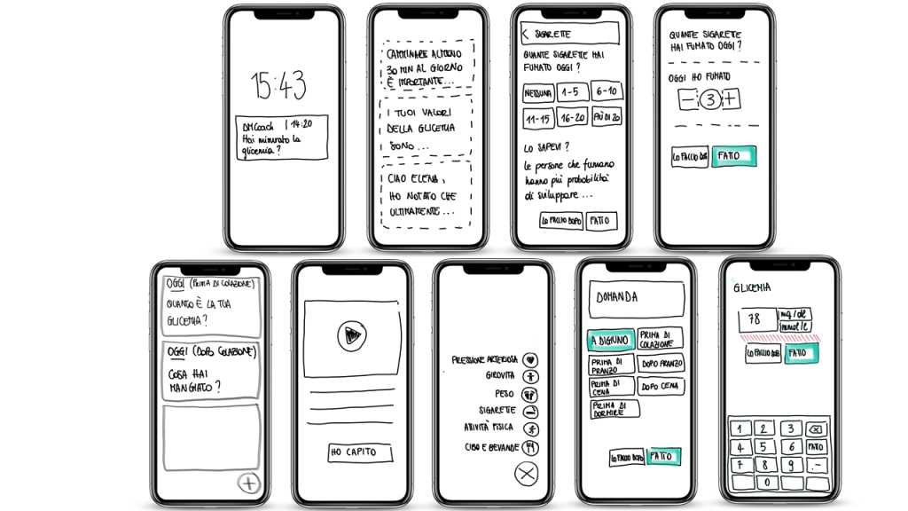
The approach
- Conversational metaphor.
- Tailored feedback and motivation based on individual data and stage of change.
- Interaction initiated by the system.
- Simple interaction, few levels, clear labels.
- One-way communication from doctor to patient: patients receive direct feedback from doctors, doctors decide when to initiate communication.
The design rationales for the mobile app (patients)
BE CONSIDERATE
Be there when users need it.
Respect users’ time, stay out of the way if not needed.
BE SIMPLE
Avoid complex interaction.
Use a conversational metaphor
PERSONAL COACH
Adapt the content based on the user’s journey to healthy lifestyle.
Motivate with tailored messages.
EDUCATE
Give useful educational content.
Give actionable and personalized feedack.
BE ENCOURAGING
Reward and motivate.
Deliver value, convey the benefit.
ADD A HUMAN TOUCH
Connect patients with doctors.
Send doctor’s advice.
The design rationales for the web app (physicians)
BE CONSIDERATE OF DOCTOR’S TIME
Allow one-way communication.
Provide a quick configuration of patients’ profile.
Provide pre-written messages that are easy to modify.
ACT AS A PERSONAL ASSISTANT
Assist doctor in the management hundreds of patients.
Allow definition of patients’ personalized lifestyle plans and goals.
Convey essential, clinically relevant, pre-analyzed information.
The design
We used Google Material design guidelines. We shared a style guide to agree on colours, typography, and the interaction style. We always had our design rationales and our personas in mind. We used Google Drive and InVision to create and share our work in progress for rapid feedback.
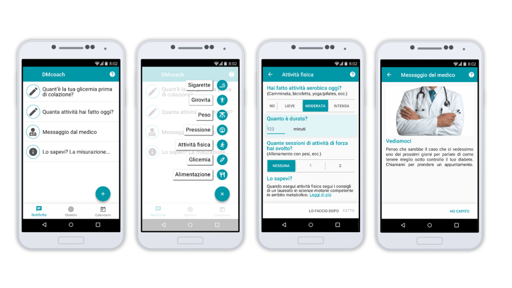
The development and user testing
As the design was proceeding, our colleagues at Engineering started to work on the back-end, developing the core features of the app, integrating the front-end as it progressed. As we had a minimum viable product, we started right away with the user testing, integrating an expert evaluation when the first usability problems were solved.
The evaluation
Once we solved all the major problems, we ran the final evaluation with the patients in two Italian cities, plus a pilot evaluation of an advanced wristband for the unobtrusive monitoring of physical activity and physiological data in Eindhoven.
DMCoach was funded by EIT Digital. In collaboration with:

