Content hierarchy: designing attention
Sometimes, digital products don’t fail because of bad features. They fail because people don’t see what matters.
When we talk about design in digital systems, we often think about visuals: colours, typography, components. But design is not decoration.
Design means structuring systems around how people think, decide and act. It means organising content, setting priorities, guiding attention and reducing cognitive effort.
In this sense, content hierarchy is not a secondary detail. It is a functional and strategic choice.
We have lazy minds

A fast, automatic system that scans the environment with minimal effort, and a slower, deliberate one that requires attention and energy.
Most of the time, it is the first one in charge.
Photo by Isaac Davis on Unsplash
The human brain is not designed to maximise accuracy. It is designed to minimise effort.
Although it represents a small portion of our body, it consumes a disproportionate amount of energy. For this reason, it relies heavily on shortcuts.
We can think of cognition as operating on two systems:
- a fast, automatic and intuitive system
- a slower, deliberate and effortful one
Most of our interactions with digital interfaces are driven by the first.
This system continuously scans the environment and produces quick evaluations, often without our awareness. It allows us to act efficiently, but it also means that we do not process all available information.
We select.
We simplify.
We ignore what is not immediately relevant.
A simple question
At any given moment, our brain is asking a very simple question:
Is this relevant for me?
In a digital interface, this translates into:
- Where am I?
- What is this?
- Can I get what I need here?
These evaluations happen quickly and with minimal effort.
If the answer is not clear, people do not invest more attention.
They disengage.
We do not read, we scan
Reading is cognitively expensive.
It requires coordination between multiple brain areas and sustained attention.
Scanning, instead, is efficient.
For this reason, when interacting with digital content, people tend to:
- skim through the page
- look for familiar patterns
- focus on a few relevant elements
Large blocks of homogeneous text, abstract language and complex sentence structures increase cognitive load and discourage engagement.
This is not a matter of preference. It is a matter of how cognition works.
Notice how attention is more effectively directed in the second text below, simply by adjusting a few typographic elements such as size, spacing and similarity.
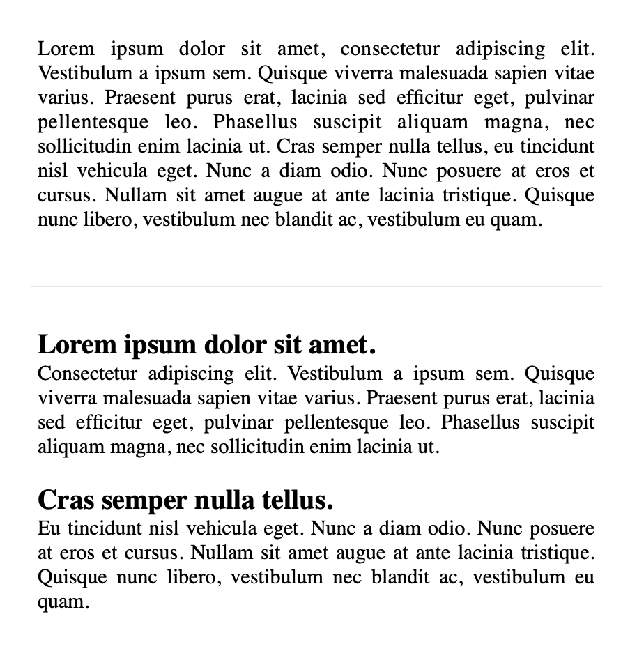
Same content, different structure. The difference lies in how the page guides attention and reduces effort.
What we mean by content hierarchy in design
Content hierarchy is often reduced to visual emphasis. In reality, it involves three interconnected layers:
Visual hierarchy: What stands out through size, colour, contrast and position
Information hierarchy: What comes first, what follows, what can be postponed
Semantic hierarchy: How content is structured (in HTML: H1, H2, H3…), supporting both comprehension and accessibility.
Visual hierarchy makes a page scannable.
Information hierarchy makes it understandable.
Semantic hierarchy makes it navigable, also for assistive technologies.
Hierarchy is a guide
When we land on a page, we are not looking for everything.
We are looking for signals.
A well-structured hierarchy helps users answer, with minimal effort:
- where they are
- what they can do
- where they can go next
Both visual elements and text contribute to this.
Elements such as headings, summaries, breadcrumbs or a short introductory sentence (“in this page you will find…”) allow users to quickly understand whether they are in the right place and how to proceed.
Attention and salience
When people first encounter a page, they do not process all its content. They initially perceive only the most salient elements.
If these elements confirm that the page is relevant, they move to a deeper level of inspection. Otherwise, they leave.
Even when they decide to read, they rarely do it linearly. They scan the text in search of meaningful entry points.
This is where visual salience becomes a design tool.
Headings, lists, spacing and, when used carefully, bold text, can help create a structure that supports selective attention.
However, salience works through contrast. If everything is emphasised, nothing stands out.
Reducing noise
Cognitive load is not only determined by the amount of information, but also by how that information is presented.
Visual noise can take different forms:
- excessive emphasis (colours, animations, multiple styles competing)
- lack of alignment or structure
- overcrowded layouts
These conditions make it harder to identify what matters. Simplicity and contrast are not aesthetic preferences.
They are functional choices.
As Steve Krug suggests, it is often useful to start from the assumption that everything is noise, and progressively remove what does not contribute to the user’s goal.
Structuring content for scanning
Effective content is not just shorter.
It is structured.
Some practical principles:
- place key information at the beginning of sentences and paragraphs
- use informative headings that describe the content of each section
- keep paragraphs relatively short
- turn sequences into lists when possible
- use bold text sparingly, to highlight truly relevant concepts
These choices help users identify entry points and navigate the content more efficiently.
Less is more
When a page contains too much information, users need to invest effort just to find what they are looking for.
This effort is often unnecessary, and in many cases, it leads to disengagement.
Reducing content is not about simplifying the message.
It is about making the message accessible.
A useful exercise is to remove a portion of the text – repetitions, secondary details, long introductions – and observe whether the core message becomes clearer.
In many cases, it does.
Hierarchy works in layers
A good content structure does not expose everything at once.
It works progressively:
- first, the information needed to decide
- then, the elements needed to act
- finally, the details for deeper understanding
This layered approach works gently with our minds and supports both quick interactions and more in-depth exploration. It’s similar to what we call progressive disclosure.
Checking whether hierarchy works
A content hierarchy should make key information immediately visible and reduce the effort required to find it.
Some simple checks can help identify issues:
- by slightly blurring the page, can you still distinguish its main structure?
- by squinting, what elements emerge first? are they the most important ones?
- by reading only the bold text, do you get a coherent summary?
- by removing part of the content, does clarity improve?
These checks do not replace usability testing, of course, but they can highlight evident problems early.
More structured methods, such as five-second tests, first-click tests or task-based usability testing, allow designers to observe how users interact with the page and whether the hierarchy effectively supports their goals.
Designing is deciding
Designing content hierarchy means designing a path for attention.
It involves deciding what should emerge immediately, what can remain in the background and how to guide users towards relevant information with minimal effort.
Headings, spacing, contrast and structure are not visual details. They are cognitive tools.
They reduce effort, support orientation and make interaction more fluid.
Once this structure is in place, a more granular level comes into play: the words themselves.
That is where microcopy makes a difference.
 Michela Ferron